- Title: Letters To God
- Designer: Alex Opfer
- Instructed By:
Todd Childers
- Course(s): ARTD 4070
- Tags: Thesis, Typography
Letters To God
There is an innate and intimate connection between hand lettering and my faith life. Hand lettering is inherently flawed and imperfect, but with a little bit of practice it can become something beautiful despite those shortcomings. This has become a perfect reflection of
my faith life, and why hand lettering has become so important to me. In fact, hand lettering has become one of my favorite forms of prayer.
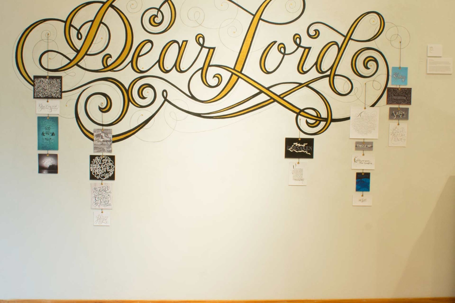
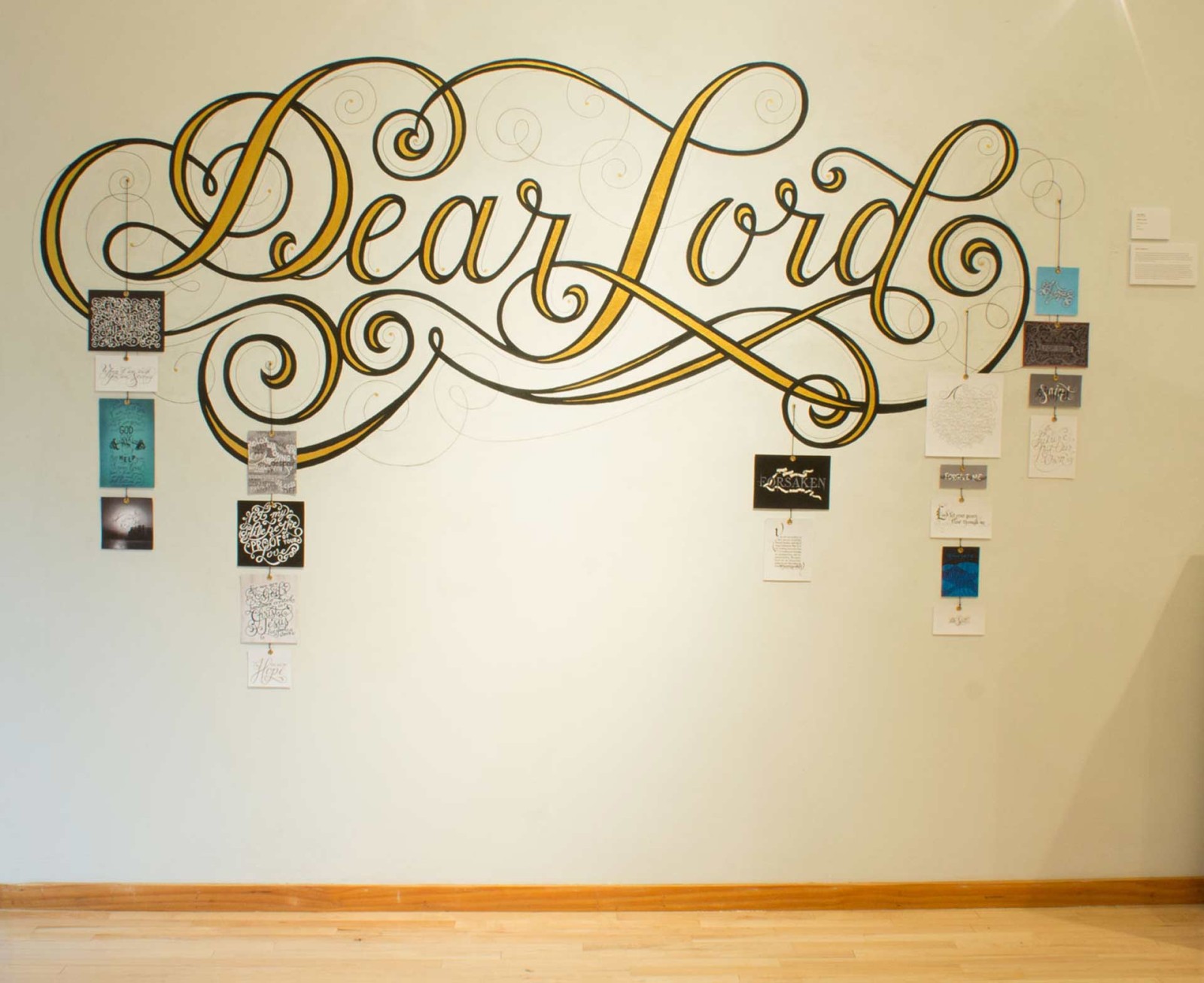
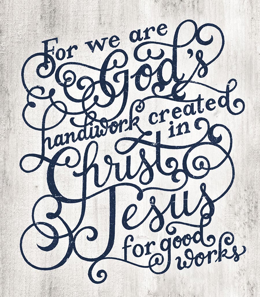
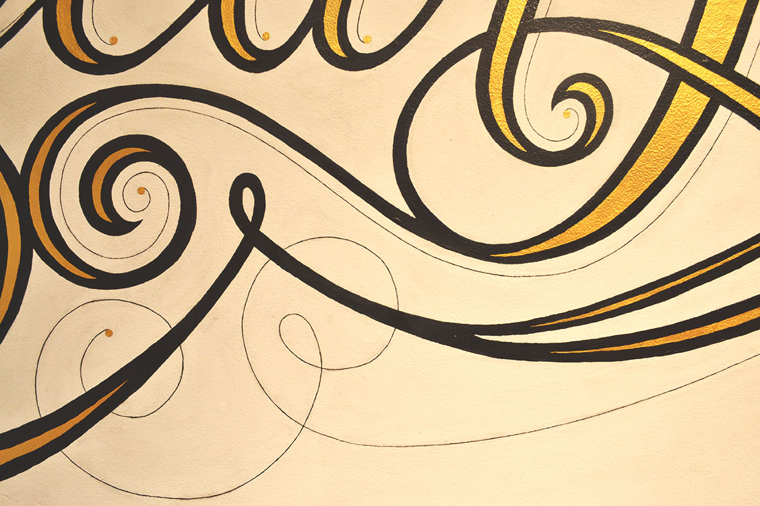
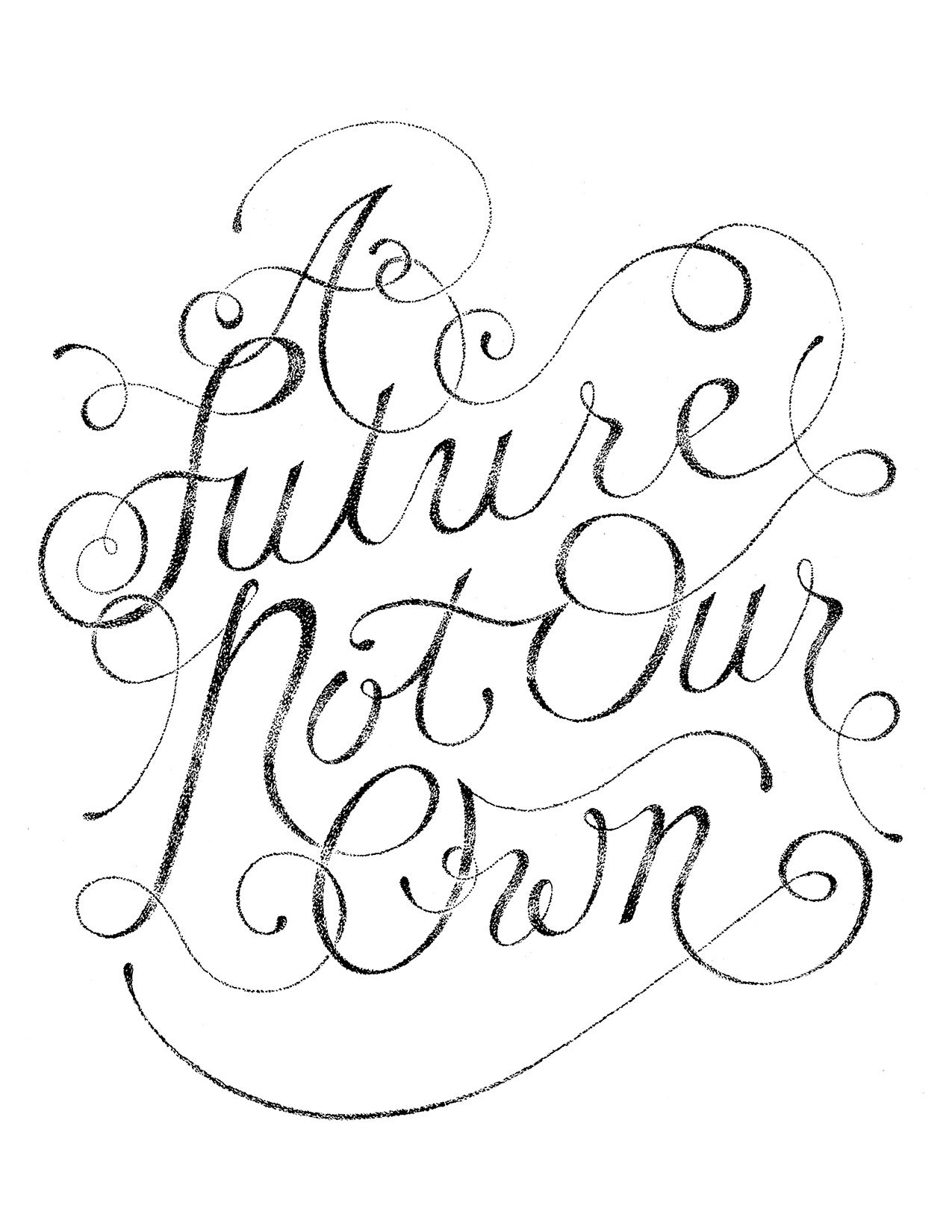
Prayer can take on many forms, but at its heart it is conversation or communication with God. For me, hand lettering has become one of the ways in which this communication takes place. Letters to God explores the connection that I have found between the two and gives an honest look into my prayer life at certain points in time, both good and bad. The title Letters to God essentially sums up this project; I view each lettered card as my personal communication with God. They contain phrases, bible verses, and my own words and are essentially what I am saying to God or what I believe He is trying to say to me. These cards are paired with a hand lettered mural, which plays the role of the letters’ salutation, and is how I begin all of my prayers. The mural is painted on the wall because the idea of process is a very important aspect of hand lettering as prayer, it allows me to focus and reflect on the words that I am writing. Each card is tied on a rope hanging down from the mural, with the knots symbolizing my commitment to prayer in times of happiness and in times of suffering. The verticality of the ropes symbolize me reaching for something higher than myself. The lettered cards are unique in size, style, and color in order to correlate with the randomness of life.
This is me, and these are my prayers.
