- Title: Mad Max Silk Screen Poster
- Designer: Chris Hatfield
- Instructed By:
jenn stucker
- Tags: Print
- External: http://www.chriskhatfield.com
Mad Max Silk Screen Poster
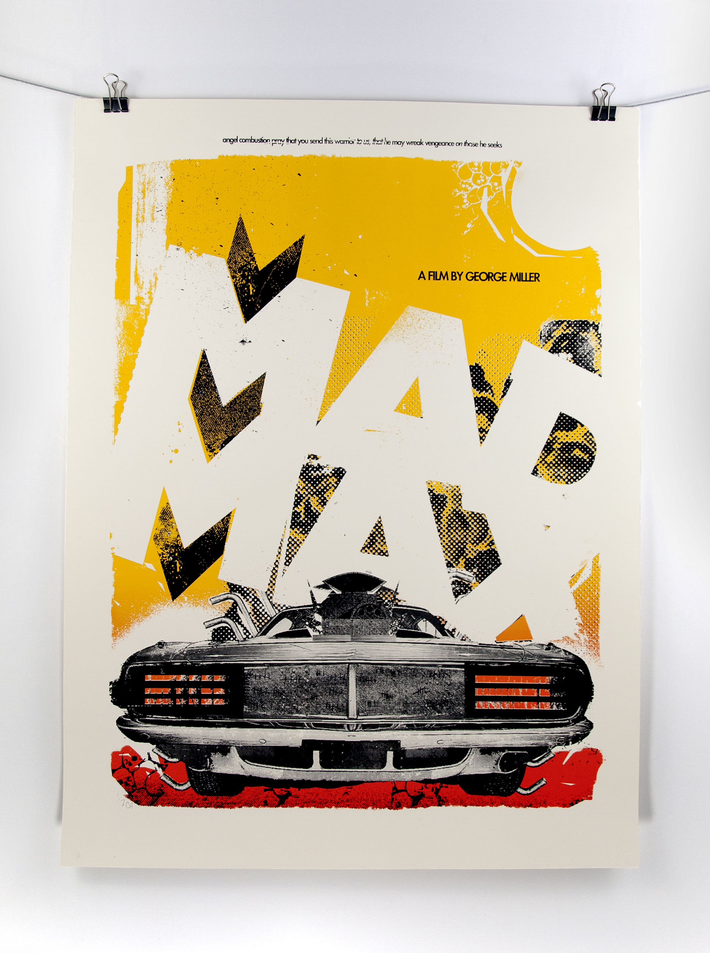
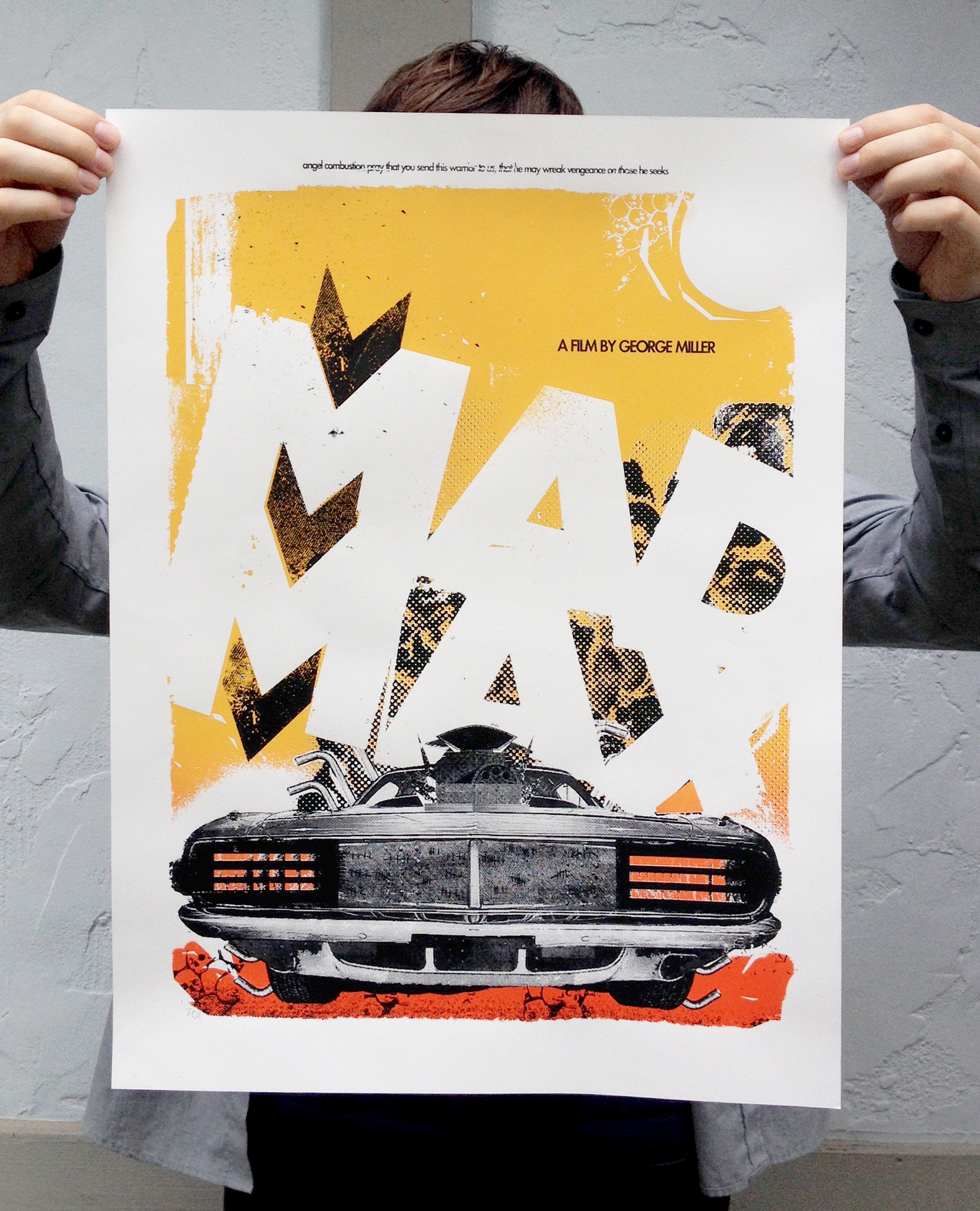
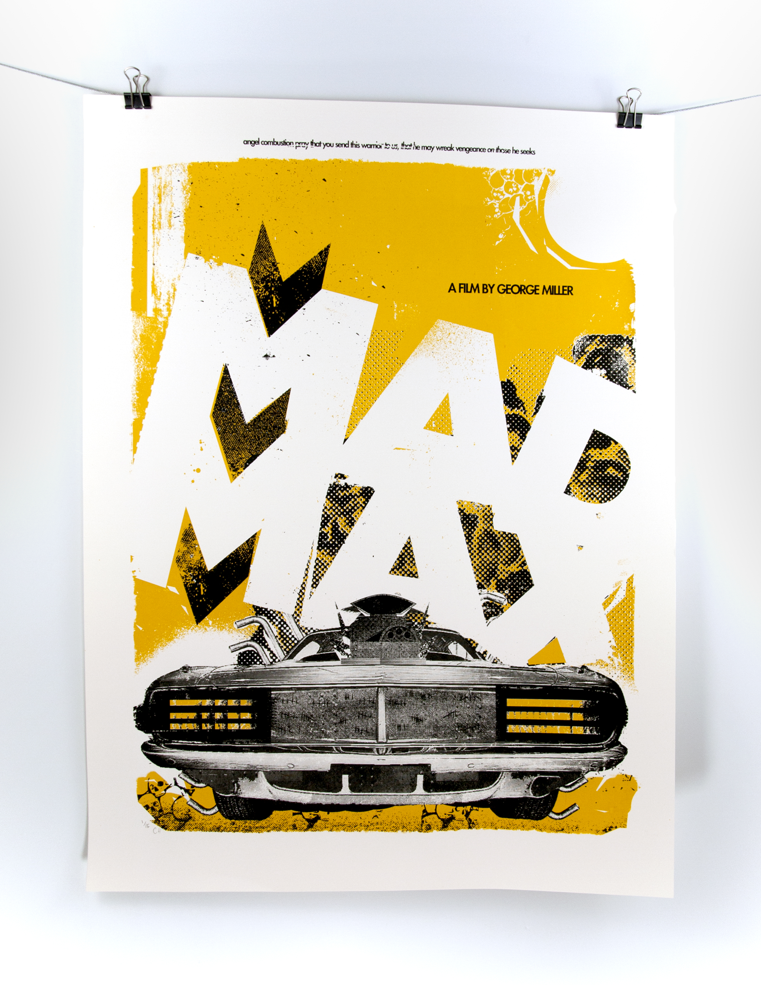
This piece was truly a labor of love. Created for the 2014 AIGA Toledo Summer Show titled PopCorn Posters, this screen print was a sweat-soaked frankenstein in the making. Down and Dirty, DIY, home screen set up and lot’s of labor.
Mad Max is one of my old school favorite film franchises. You would be hard pressed to find a film or comic nerd like me that doesn’t have an affinity for the look, feel and set style of the series. Not that there weren’t plenty prior to Max, but many post-apocalyptic films made after Mad Max clearly pull from the films visual style.
A friend allowed me to use his home screen print rig to create this work. The set up is tucked into an alcove at the top of the basement stairs. Truly a thing of maniacal beauty, the pull table is homemade and powered by a shopvac for suction.
Our exposure unit had a tiny leak in the air hose, tricking us for multiple burns. We coated, dried, burned, and washed screens for an entire day before we found this teen tiny leak, just enough to allow a minuscule amount of space between the image and screen. Eight hours of sweaty, fruitless screen washing and coating can be frustrating, but it makes the victory all the more sweet.
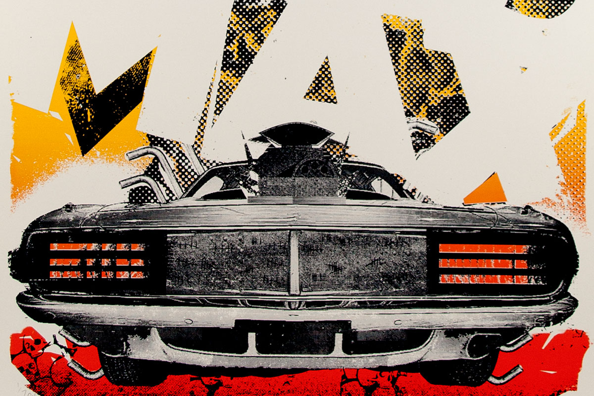
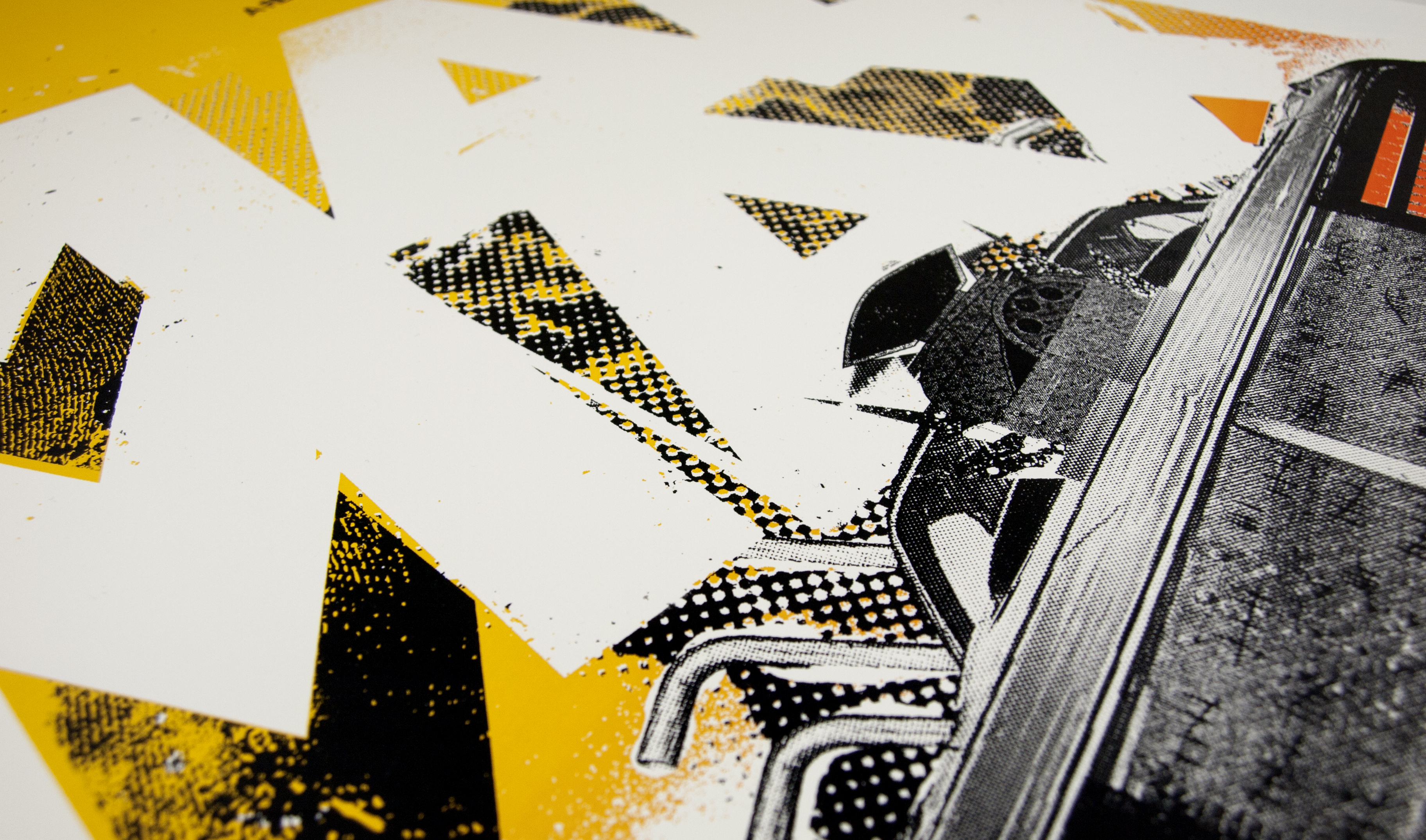
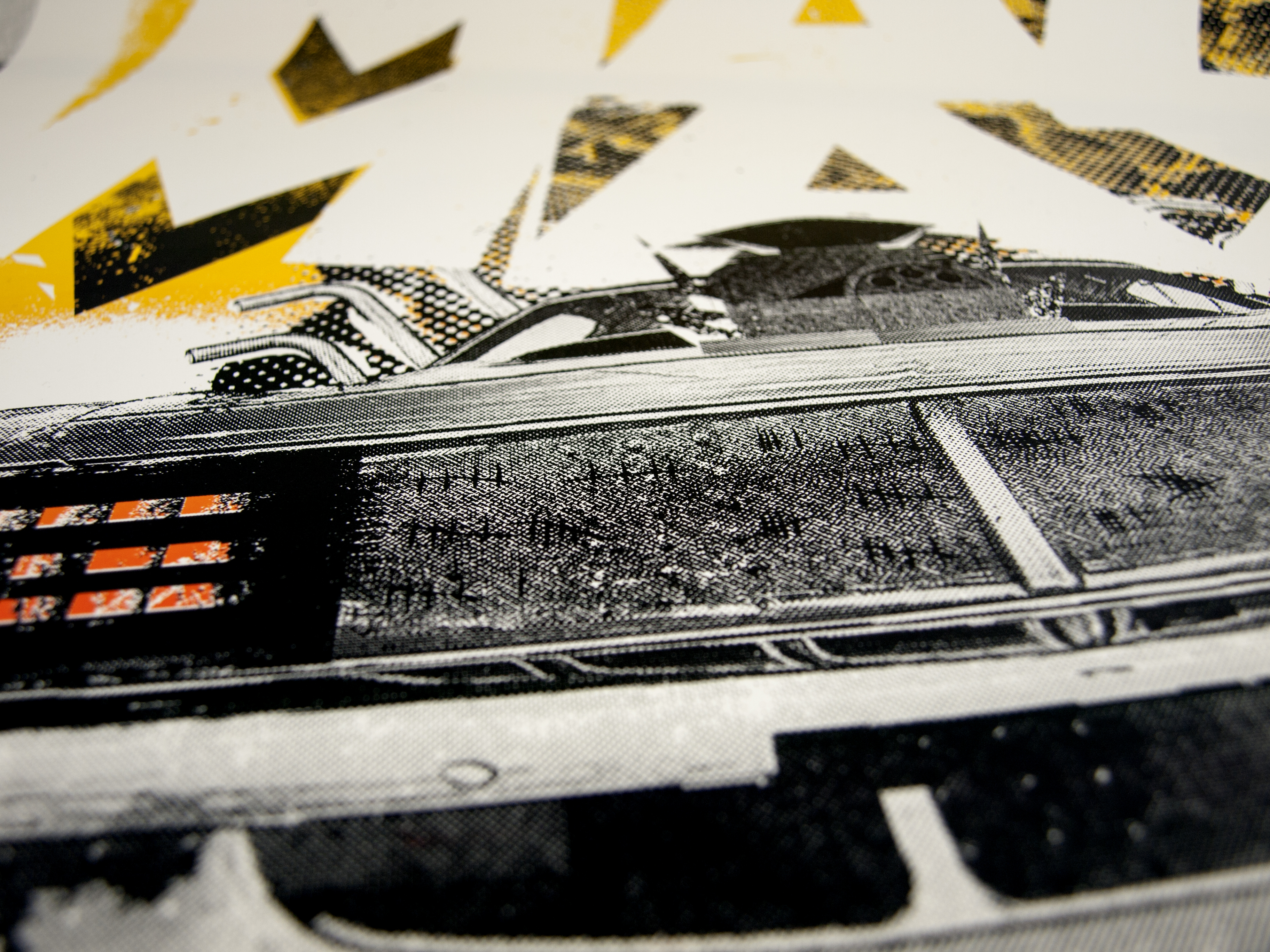
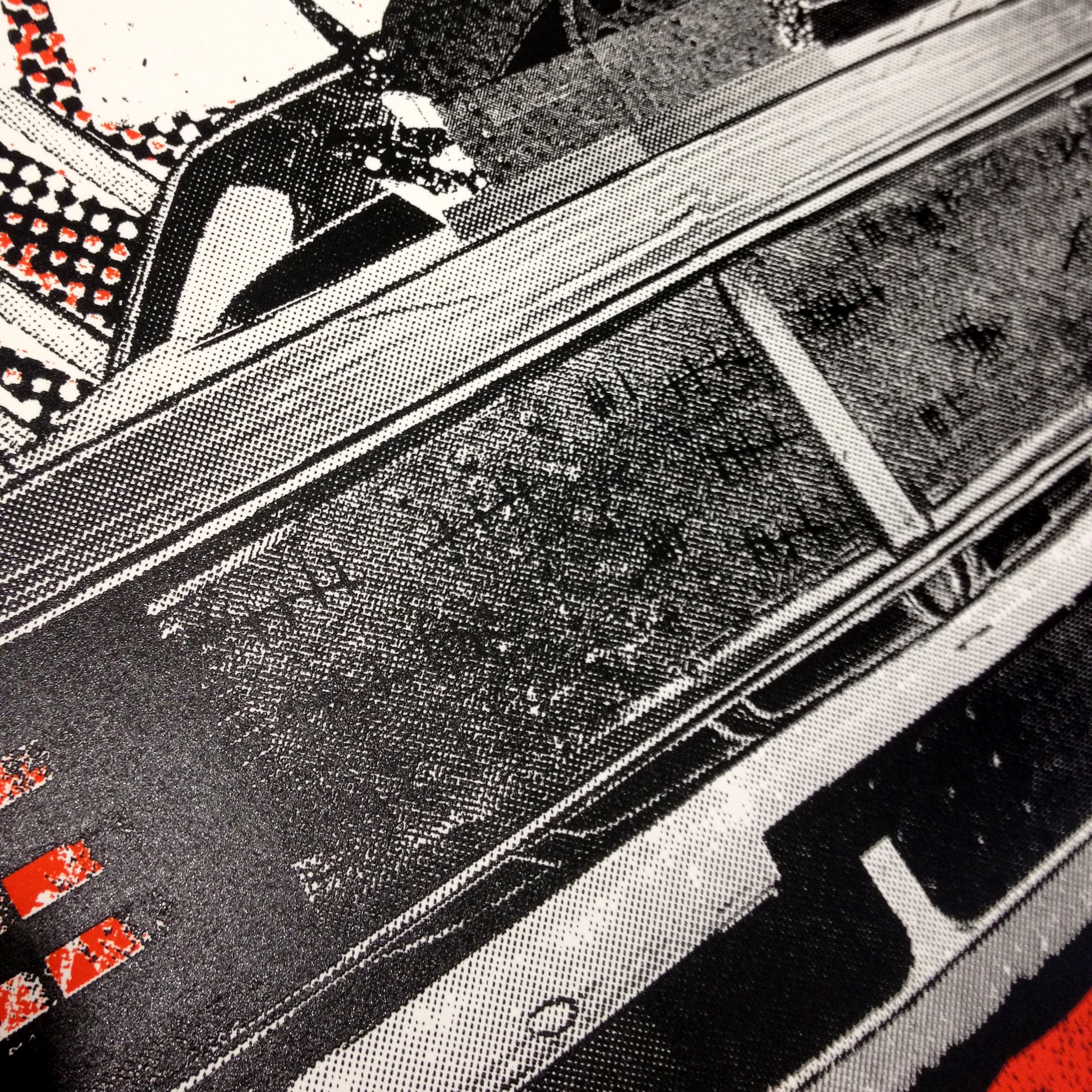
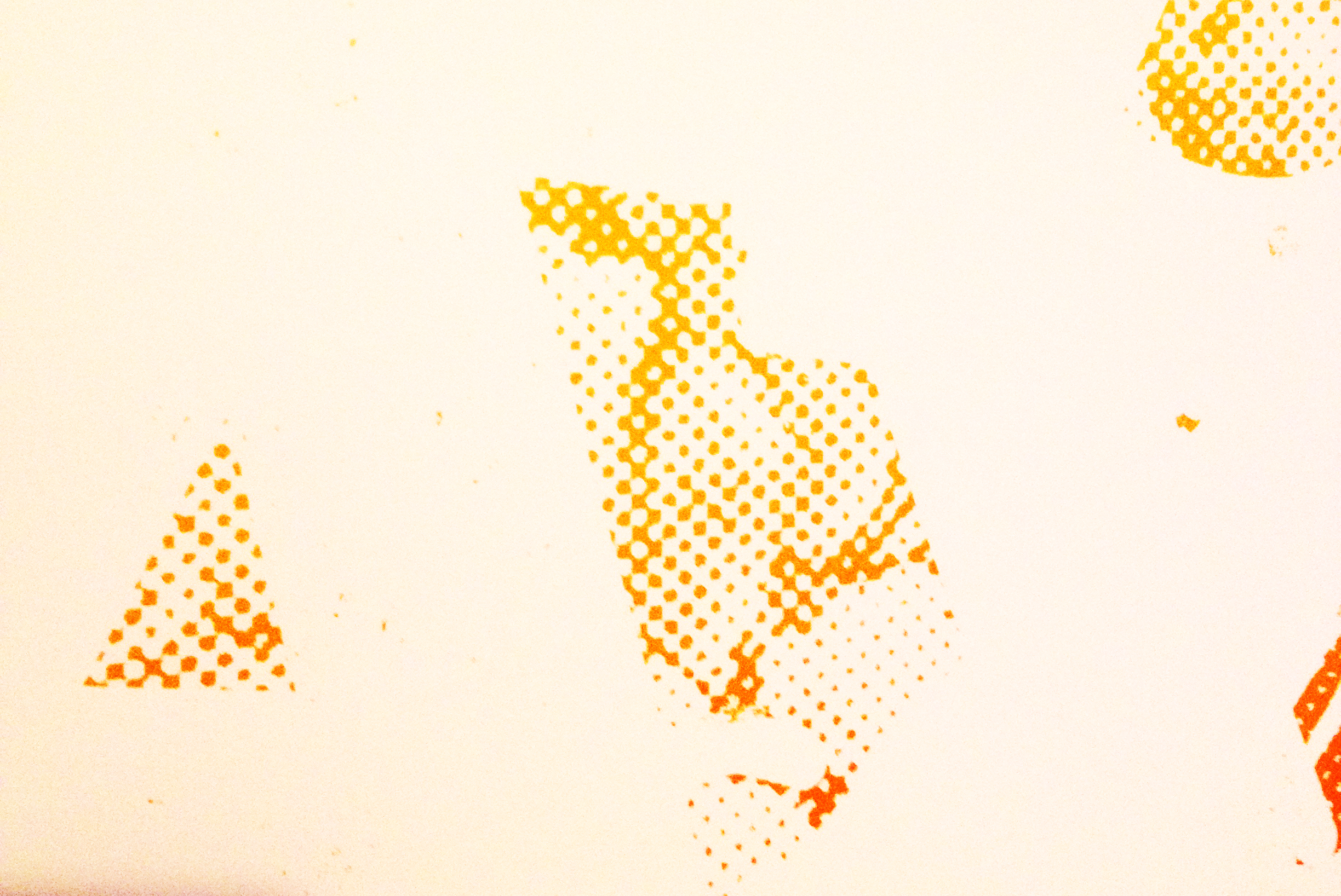
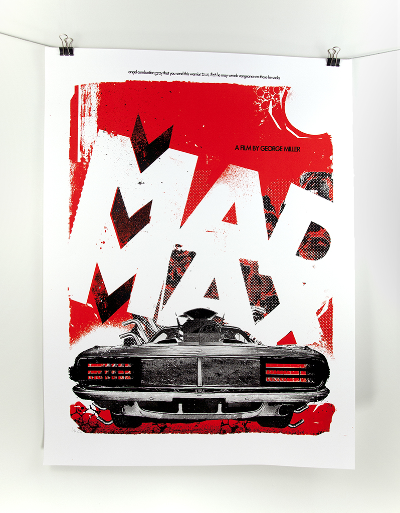
In keeping with the comic love affair I’m sure I’ll have all my life, the pulp sensibility of halftones reminded me of gritty desert sands and rusted, chewed steel. The car was hacked together from multiple images and halftone patterns of various cars and car parts. The engine was built from various halftone patterns, and random exhaust venting ported in for an irrational, impossible beast to take form as Mad Max’s car.
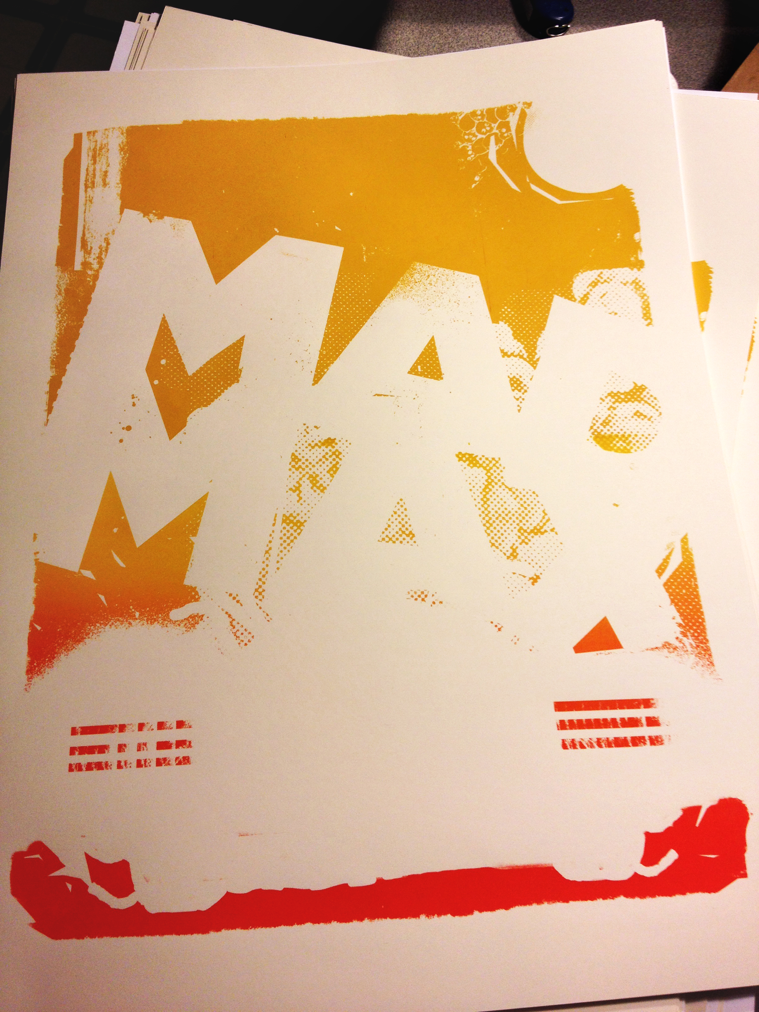
The printing process itself wound up reflecting the theme, as our largest screen size was 16×20 and our print was 18×24. To accommodate this, we had to burn four screens, two for the color flood in the backgrounds, and two for the black layer on top. We then manually aligned the four screens for every pull in the series.
To experiment, we ran prints on cougar 80lb cover ivory, and also white. The series was a compilation of yellow backgrounds with black detail on ivory and white, but the limited edition of belnd roll prints was pulled primarily on ivory. The subtle creme tone of the ivory enhanced the overall cohesion of the piece, and the final step was the blend roll.
We performed a fire-red blendroll into custom yellow, and had to hit the blend just right for the background gradient to transition across the screen split without being noticed.
