- Title: PROOF: Portfolio Review Day
- Designer: Chris Hatfield
- Instructed By:
jenn stucker
- Course(s): ARTD 4700
- Tags: Branding, Interactive, Print
- Award: HOW International Design Award // 2014
- External: http://www.chriskhatfield.com
- External: http://tinyurl.com/proofbgsu
PROOF: Portfolio Review Day
Concept
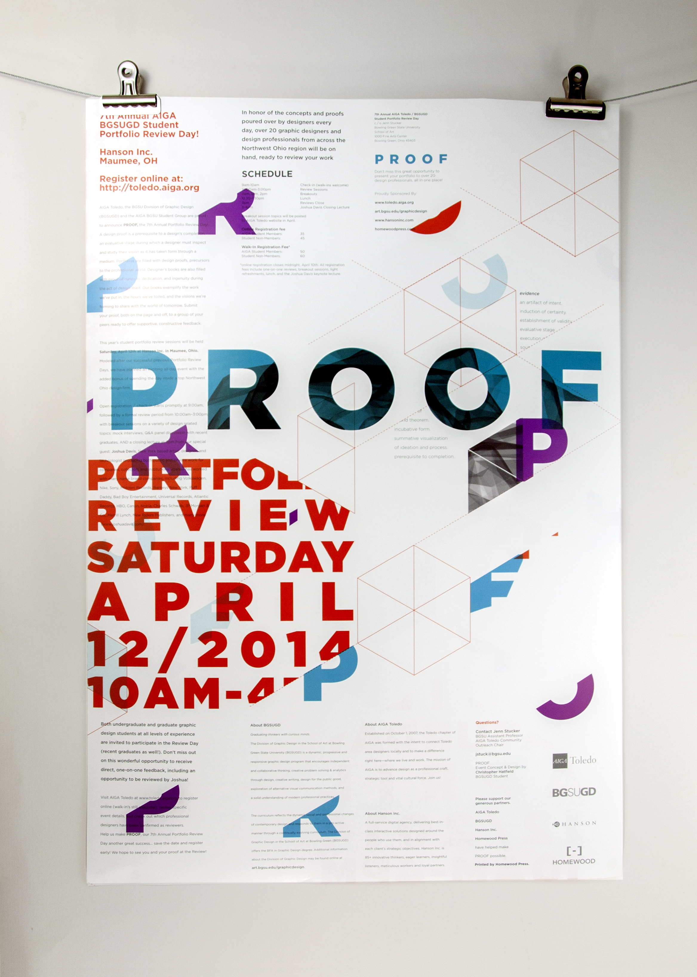
BGSU offers students and recent grads from any area university the opportunity to take part in an Annual Graphic Design Portfolio Review event featuring guest speakers, breakout sessions, and excellent opportunities to meet like minded creatives.
I was selected to take the helm for an Independent Study during Sophomore level classes with Mentorship by Graphic Design faculty member Jenn Stucker.
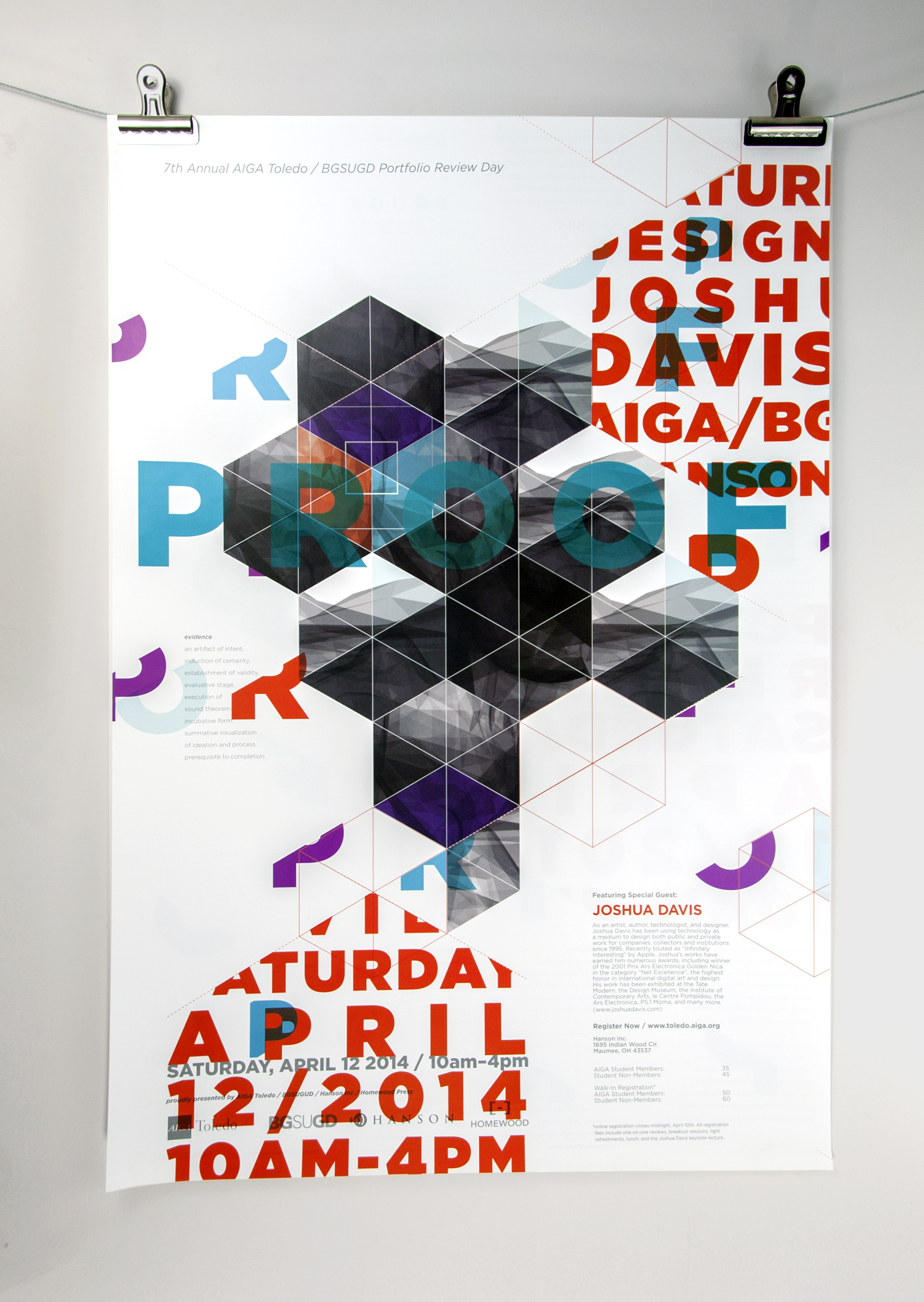
Our guest speaker for the evening was Joshua Davis, an award-winning generative artist exploring the boundaries of art and technology through software and hardware manipulation.
Proof was an apt title as it referenced a multitude of underlying themes. As designers we are faced with proofs daily, while in a review context our work serves a precursor to our professional lives, proof of our own validity and intentions. Ultimately, I also hoped to bring together enough creative minds to also create literal proof; a one time only site specific experience or moment which allowed us to provide experiential, if intangible, proof of our event in a way which could only have been arrived at as the sum of the parts involved.
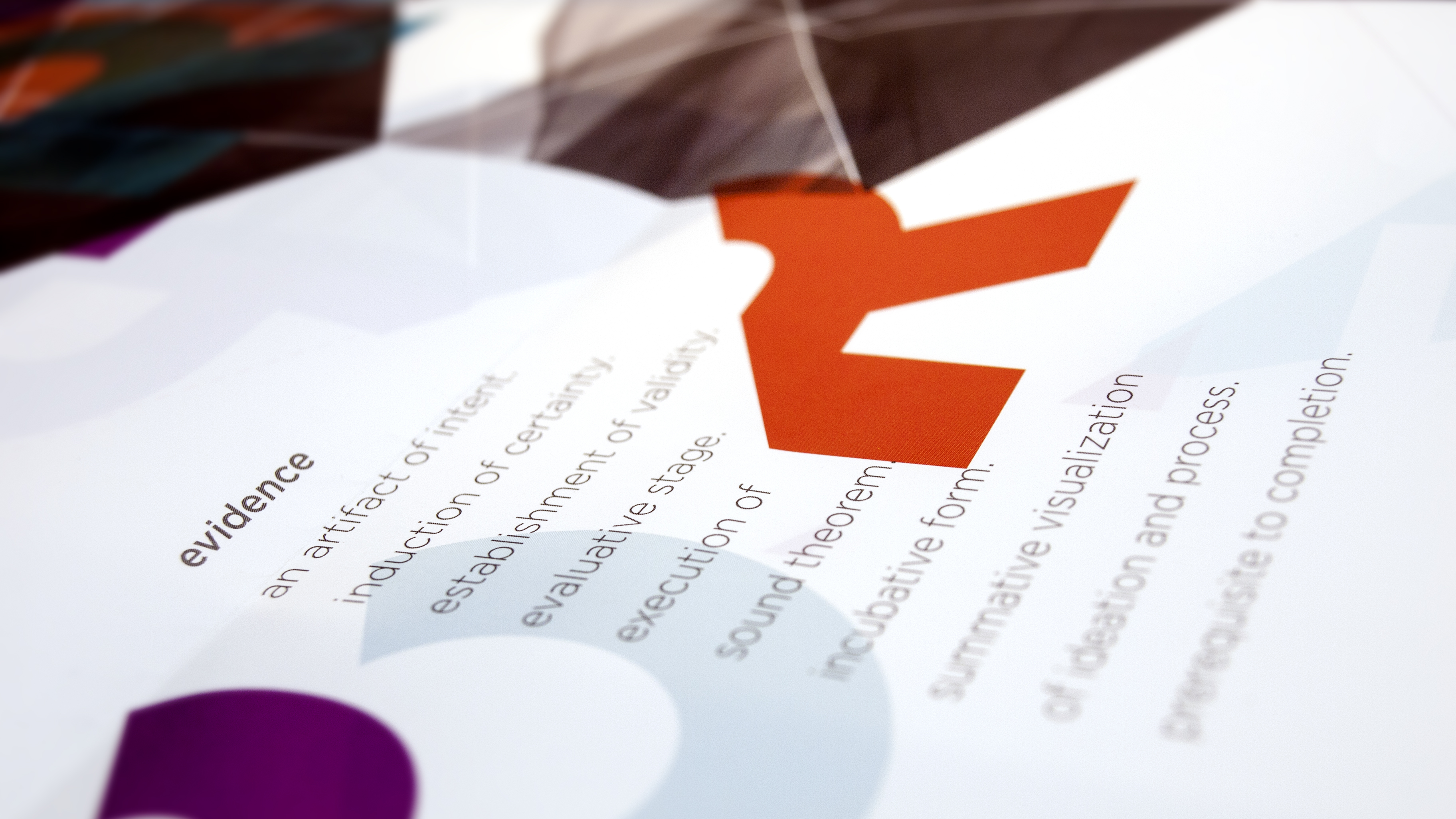
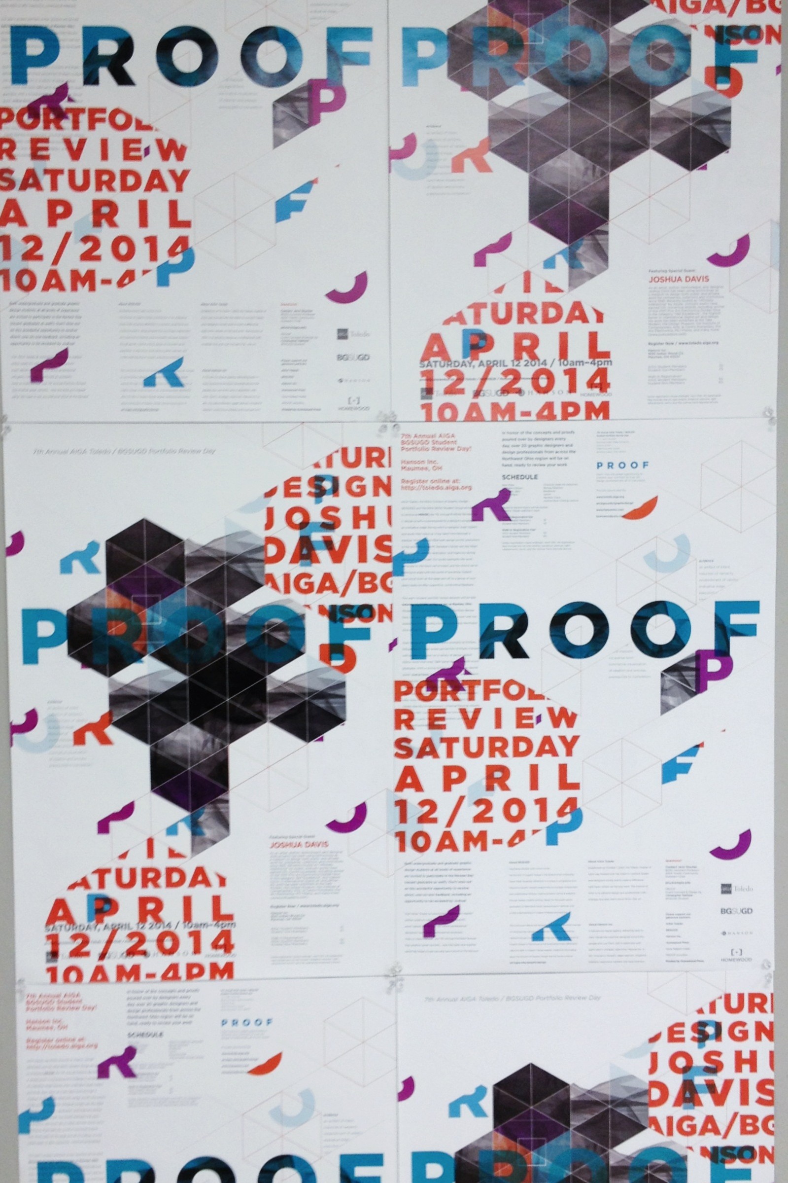
I began exploring process, thinking generally in textures and building blocks. The concept of Proof ultimately dealt with the unfinished idea, an evaluative stage. I wanted the work to reflect that first moment in ideation when anything is possible, when our atoms start communicating, our mind begins making associations, and our instincts begin informing our process.
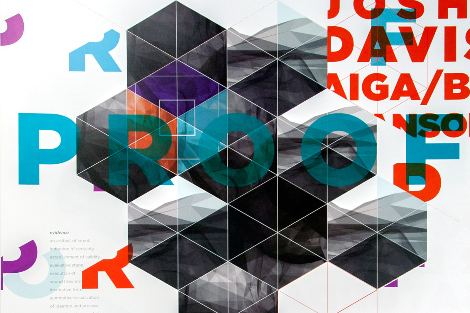
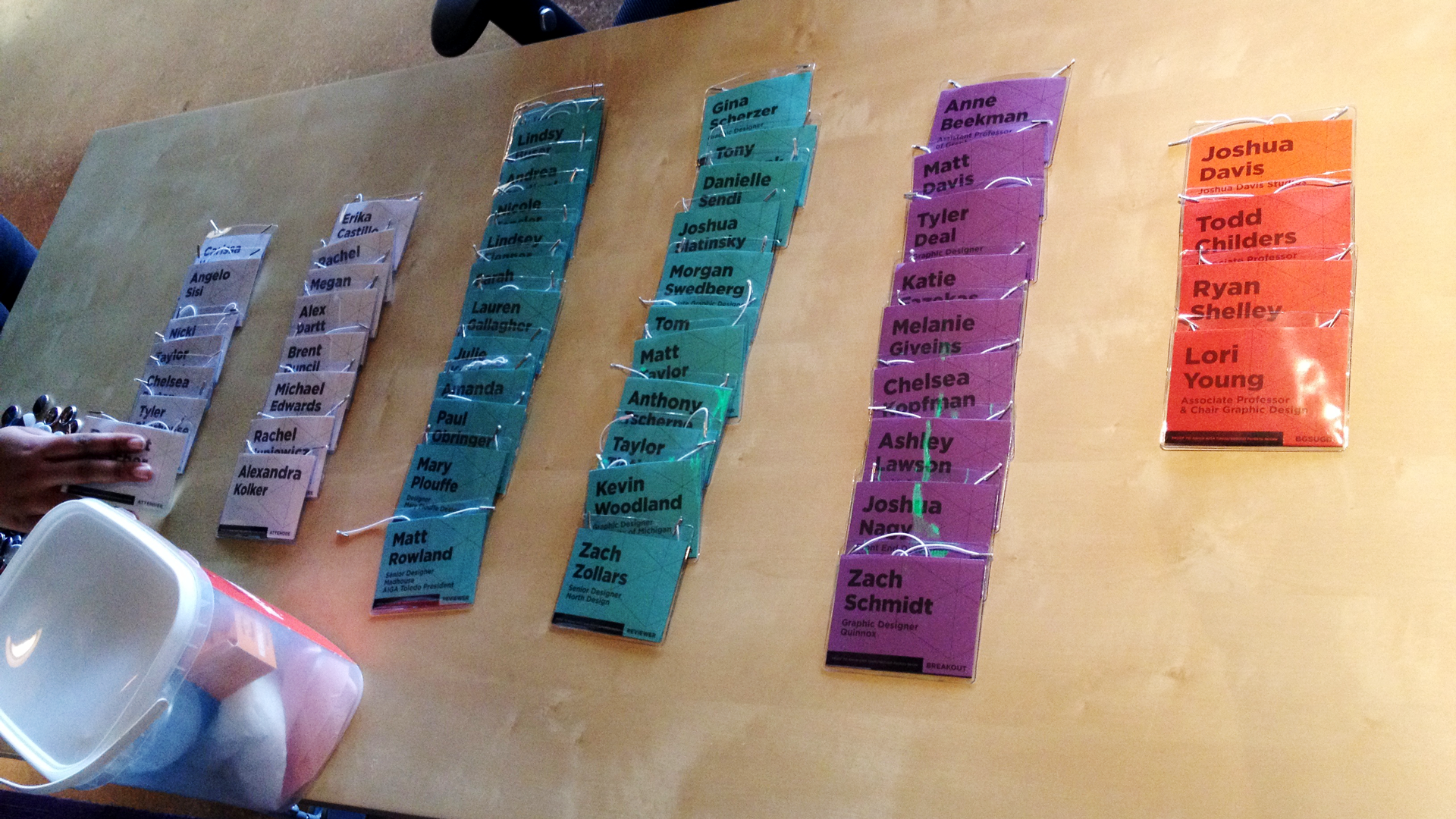
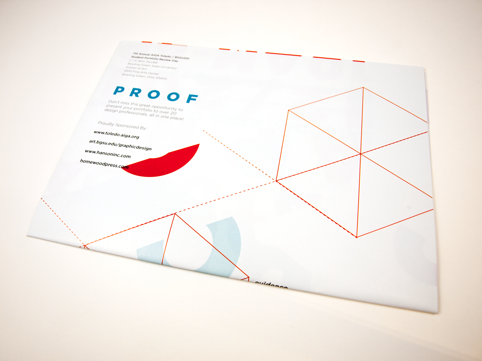
The hexagon was a strong building block which allowed me to create a modular and organic composition. By breaking the hexagon into sections I was able to color code the event. All Portfolio Review Session collateral was branded with blue tones, all Breakout sessions featuring speakers and Q & A’s were branded purple, and anything relating to our Keynote speaker Joshua became Orange. Faculty was represented with an off red, and student attendees with a paper white.
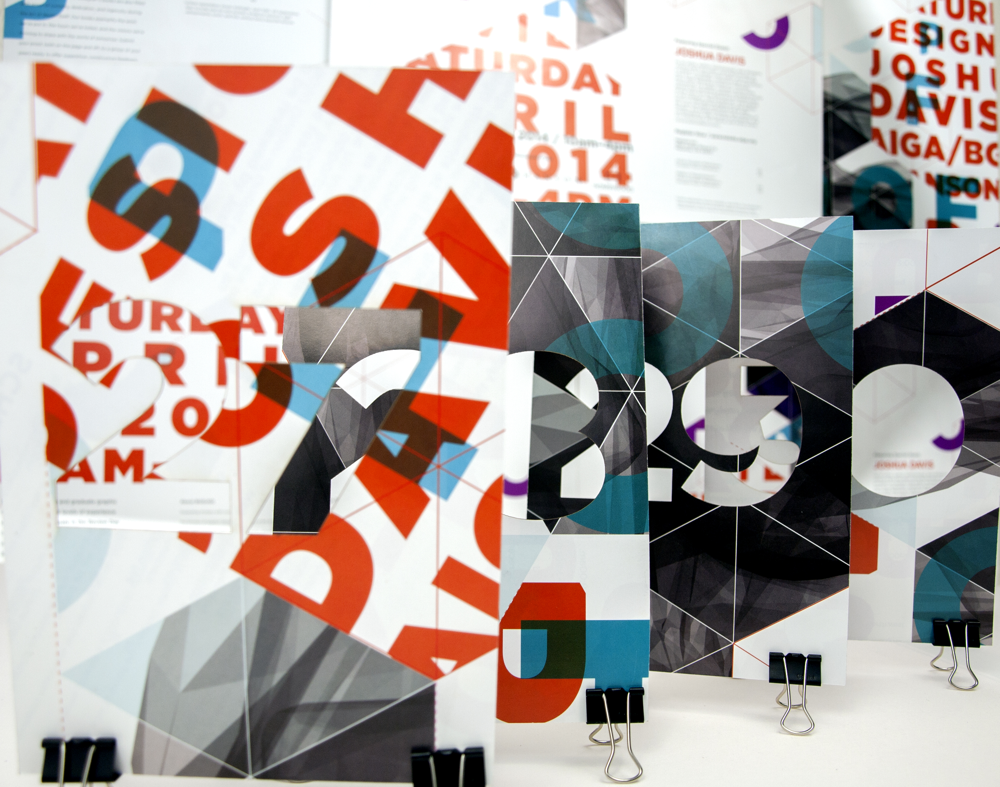
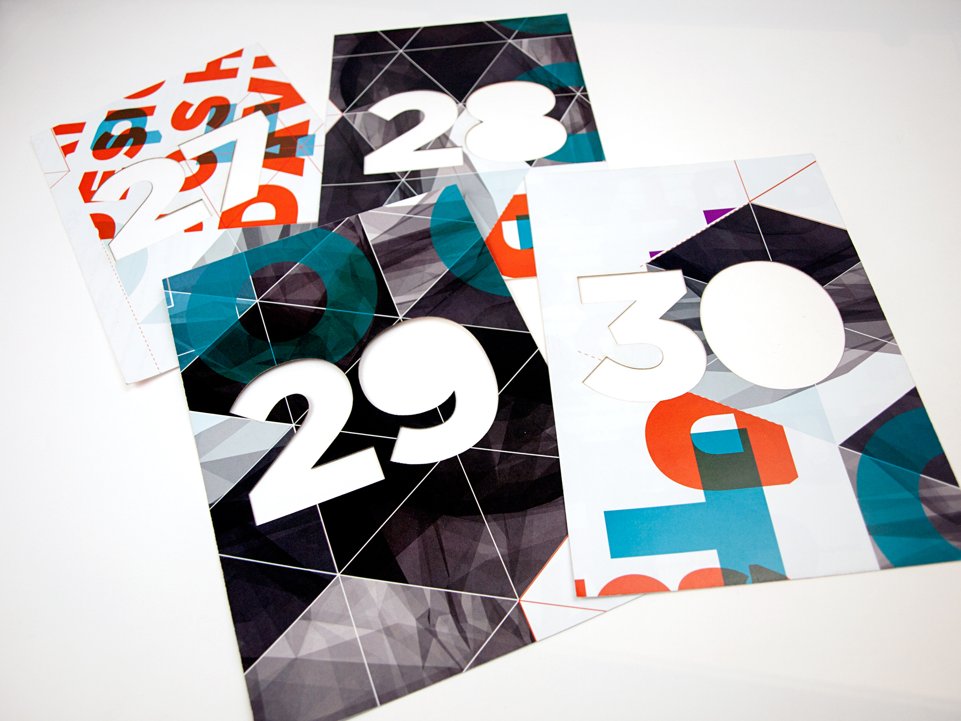
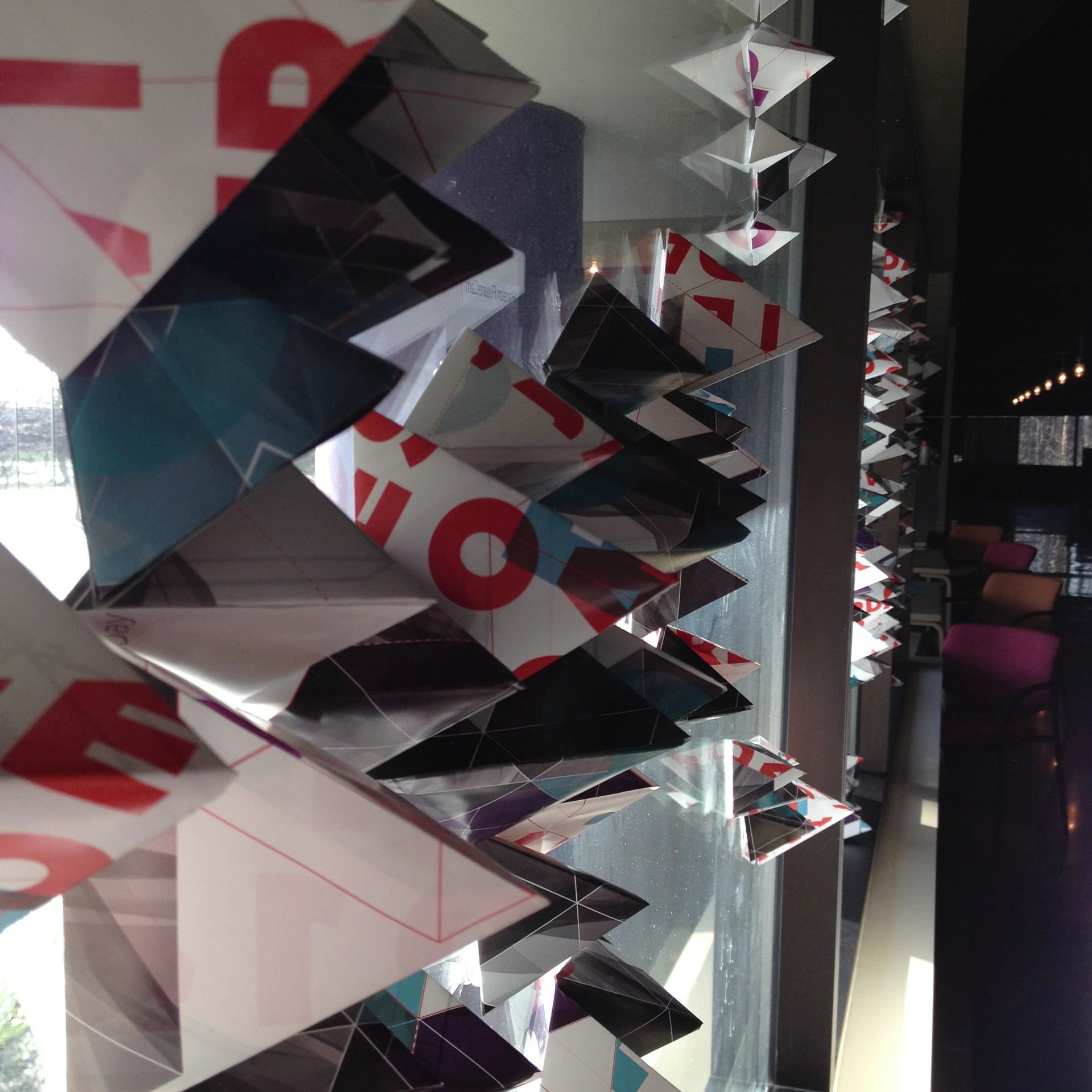
Hand Crafted
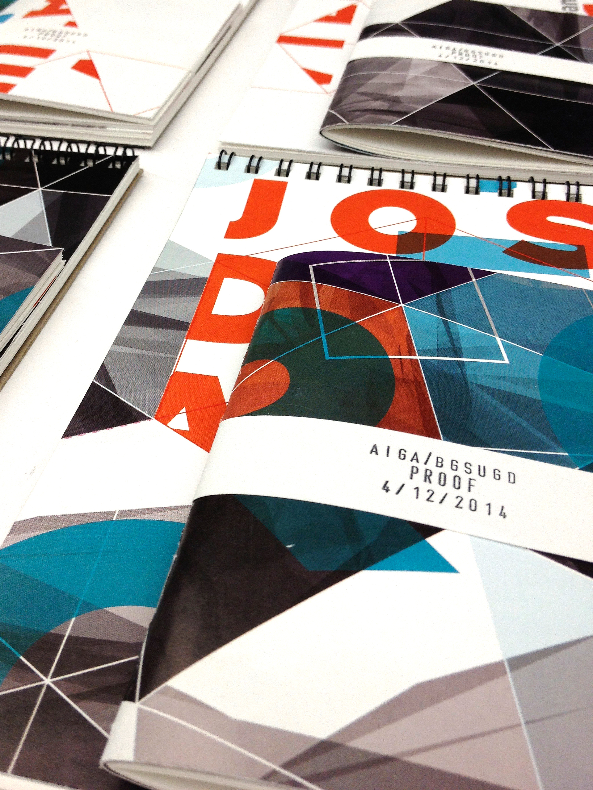
Thanks to a generous overrun from our print partners, Homewood Press, we had ample resources with which to to create fun take-home items, signage, and environmental elements.
Interactive Apps
The final piece of the puzzle was realizing an event-specific example of PROOF, something generated by the interaction of those involved in the events creation as well as the attendees. I had questioned the experience of a Portfolio Review in a digital agency setting. Do we still need hourglass timers? A stopwatch? What does the schedule of an event in this space with these components look like? Given our generous host for the event site, the headquarters of area design firm Hanson Inc., I was extremely fortunate to find a group of technologists, coders, and designers interested in collaboration.
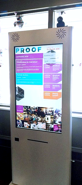
Various versions of an interactive project came to mind, but ultimately I went with a very simple responsive layout that relied on the simple delivery of information in an easily digestible format. After a series of emails, Erik Porter at Hanson was able to give enough time to enact my wireframes for an interactive touch screen kiosk that provided information about the reviewers, the schedule, the upcoming events and breakout sessions. All relevant information was available through the touch screen, freeing event attendees and volunteers from much of the busy work, leaving time for genuine interaction.
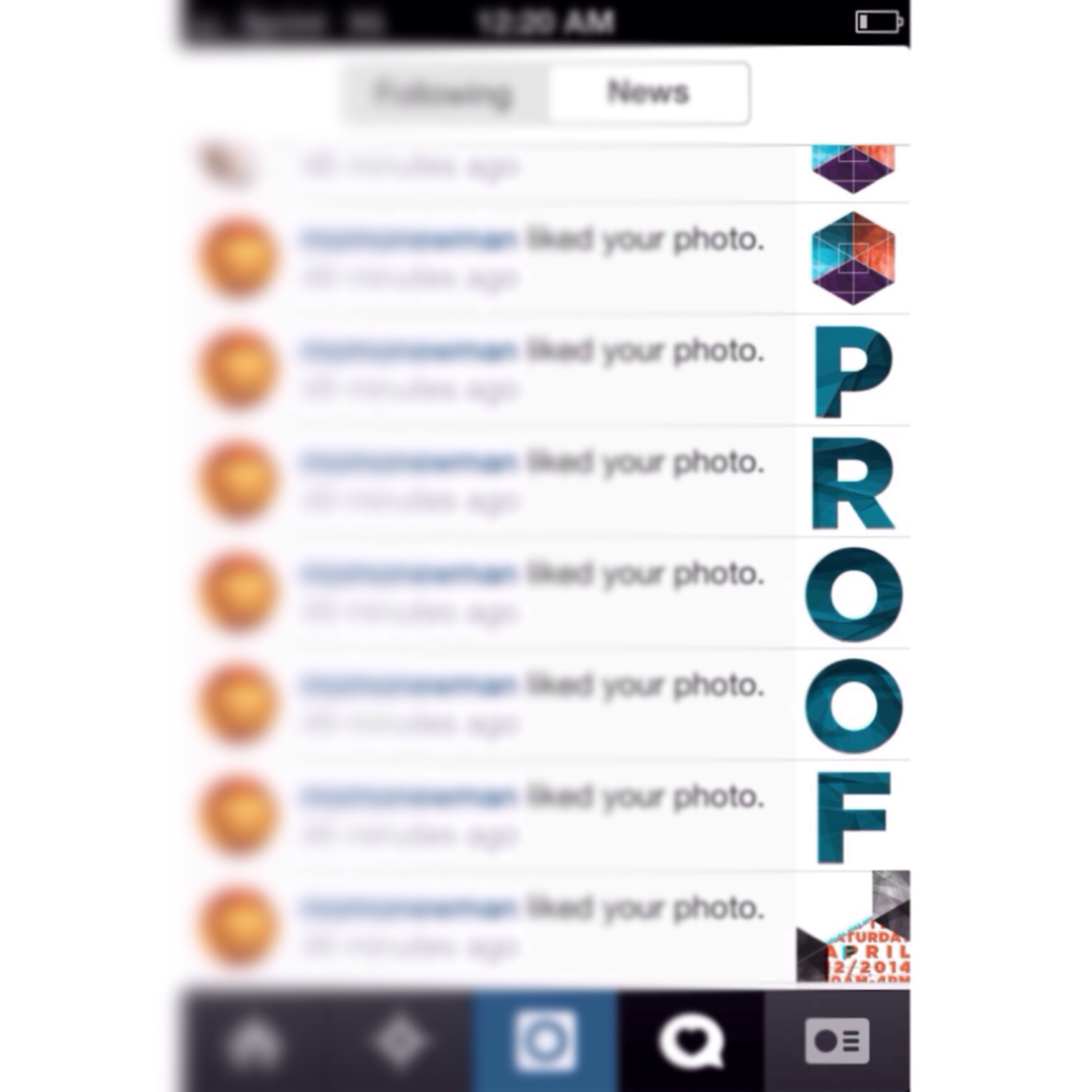
Attendees were able to utilize the hashtag #PROOFBGSU through their Instagram accounts to view their own event photos in the feed at the bottom of the screen and view with lightbox style slider on touch activation. These wireframes were developed lightning quick and still made it to screen error free thanks to the code collaboration with Erik.
I also worked out the aesthetics for a visual timer which was then displayed on screens around the event space. I learned extremely valuable lessons here. The logic and theory of user interaction and app flow seem intuitive enough to me, but the experience here taught me invaluable insight into perfecting the details, and on the ground insight into how even the slightest change in automated instruction or guidance can influence a user’s experience of an event.
Value
The speakers were great, and I learned a lot about the process of putting together an event for designers. Even though I didn’t have a portfolio to show at the event because I was just entering the program at a sophomore level, I felt like my hard work was a strong example of the type of person I am and the designer I’m aspiring to be. I made strong headway in meeting educated and talented designers in the area and abroad, and received some extremely supportive and encouraging words from many talented individuals. I had my first “unofficial portfolio review” where Joshua Davis took the time to go through some of my unprepared art files and discuss the work I had been focusing on. He rattled my cage quite a bit at first, which now knowing Joshua is probably getting off fairly easy, but at the end of the day, I felt strongly that I was on the right track thanks to his direction. He offered me wise advice and a huge compliment through his expectation. I’m truly lucky to have had the opportunity. The experience, and the people I’ve met, have all been exceptionally supportive and helpful. Proof that design is a wonderful thing.
Our Partners
Joshua Davis
AIGA Toledo
BGSUGD
Hanson Inc.
Homewood Press
Commerce Paper

